
This is a test Post to document the template for future posts (each called a story for environmental portraits).
I decided to limit the main structural blocks to Columns and Paragraphs. In fact, as this example shows, ‘bare’ Paragraphs do not have the same layout so overall limit is that the structural blocks at the highest level are all Columns each one containing one or two Columns.
Full width paragraphs for ‘story’ text typically at beginning and end of a story and potentially somewhere in between for example with a change of location and/or theme within the story.
The top-level Columns is effectively an image block with at least on Column and sometimes two. images (only two if they are closely connected).
Mostly this Columns will contain two columns. If not empty (that is for spacing), those columns will contain an image with a paragraph under the image that describes that image in the context of the story.
For image blocks containing a single image, the other column will mostly be empty, but for the sake of variety sometimes it will contain the description, rather than having that paragraph under the image.
These two columns can be 50:50, 66:33 or 33:66 depending on one or two images and the format and size of the images. The aim is to get both images to the same ‘native’ size so both format and size need to be considered. When there are two images it makes sense to have them arrange left to right in ‘story’ order, although if they are at the same step of a process then other considerations will determine the order.
With a single image it can be in either column and it probably makes sense to alternate. If the image description is in the other column it sounds attractive to alternate, but on a phone screen that may mean that the two descriptions will be adjacent (assuming the columns stack strictly in order with no sense of content.
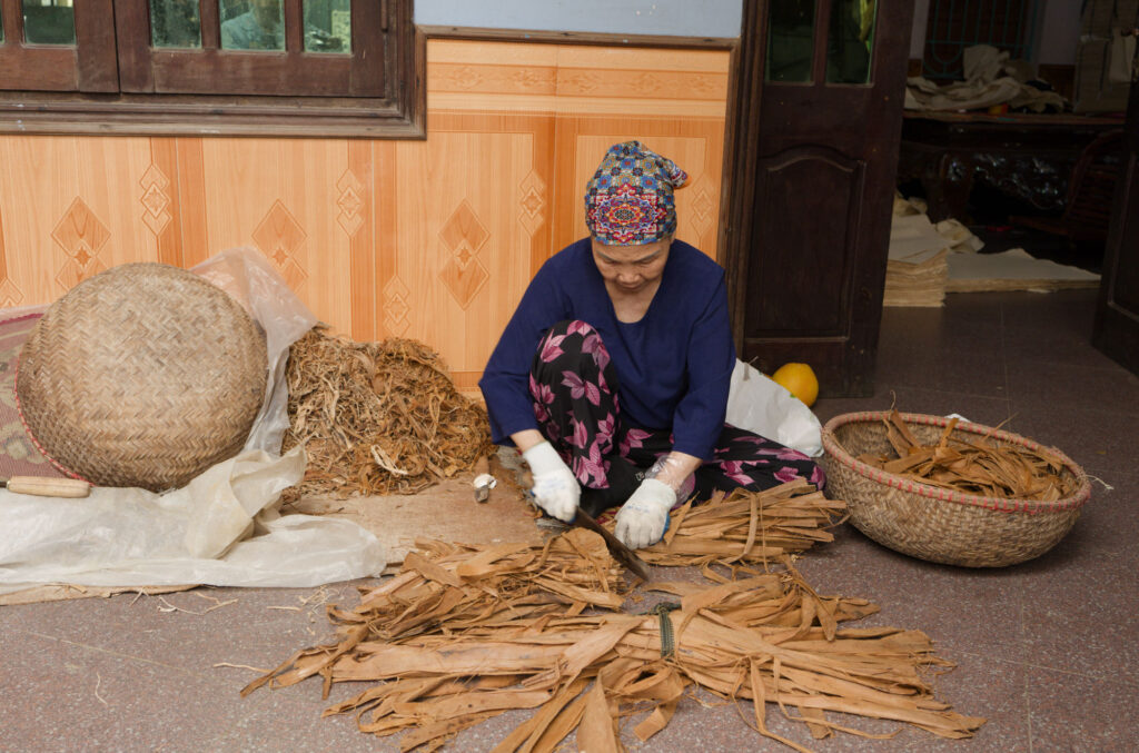
Two columns with single image and text below.
‘Image’ text normally should be limited to the width of the image like this example. In many cases, at least on a large screen the text may not even be this wide.
Two columns with single image and text in the RH column.
AVOID alternating image L & R. It is visually attractive on a desktop but confusing when image blocks are stacked in mobile.
Two columns with single image and text in the LH.
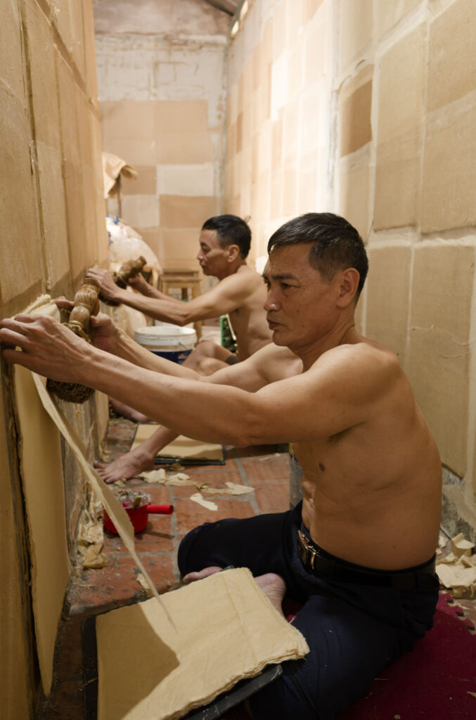
Text for image 1
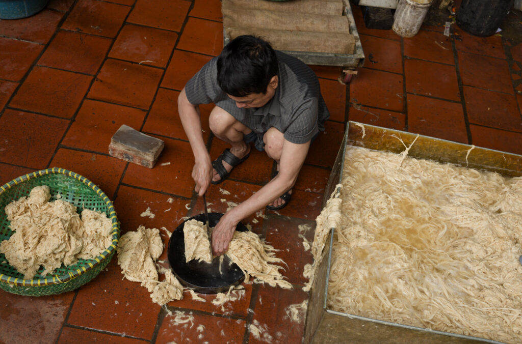
Text for image 2
Two columns with two images each with text underneath.
AVOID THIS – this paragraph is underneath and OUTSIDE the columns block. Individual css was tried, but unable to get it working on both desktop and mobile (@media caused error).
Sometimes it will be appropriate to have text here that relates to both images and sometimes that would mean no need for text underneath one or both of the individual images. Note that in the case where neither image has text underneath that when images are stacked, the first will have no descriptor until the viewer scrolls down to the combined text – this will be confusing if only one has individual text.
Single column with image and Paragraph under the image.
Description of this image is wider that the image so it fills the whole column width. Arguably this will look a bit weird. Two columns at 50:50 does not show the image at full width even if the other column is completely blank.
This is a be a Paragraph inside a Column and that is inside a Columns block. It does not appear to be possible to have a Paragraph directly in a Columns block and in any event it would probably not match the layout of a Paragraph associated with an image i.e. in a Paragraph in the same Column.
And another